In an age of hyper marketing, intense competition and tightly controlled PR, it’s amazing that truly horrible ideas can still make it past the brainstorming stage. Whether it’s the nightmare of design by committee or just a conflagration of mediocre talents pulling the wool over the eyes of out of touch rich CEOs, we occasionally see awful designs rolled out in an underwhelming explosion of anticlimax. Today, we analyze the most recent Scottish obscenity with the resurrection of Somebody Approved This.
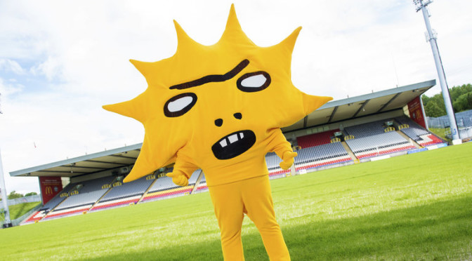
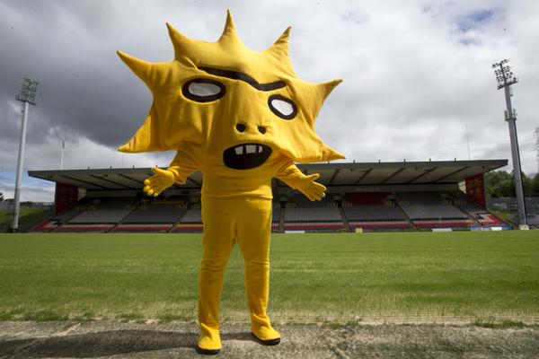
To our regular readers of Somebody Approved This: first, an apology. Not only has it been several months since the last iteration of this column, our return today takes a radical departure from previous posts and does not deal with a jersey. We would like both of you to rest assured that this is a temporary departure, and normal jersey ridicule will resume whenever I get off my lazy ass and pen another entry. This week, in a move one imagines is designed to reduce the incidence of lost children at football matches by ensuring they spend the afternoon clinging to their parents’ legs in terror, Scottish Premiership club Partick Thistle FC unveiled their new dark prince mascot, Kingsley.
Mascot: Kingsley was designed by award-winning Scottish artist and Partick Thistle FC supporter David Shrigley. According to the club’s website, he “moved to Glasgow, from sunny California, with Kingsford Capital….” Kingsford Capital, of course, is the American institution that recently invested a six-figure sum in the club, and Shrigley drew his inspiration not, as one might expect, from Dante’s depiction of the seventh circle of hell, but from that company’s corporate logo. Hooray for modern football.
Year spawned: 2015
Reaction: “Kill it with fire!” Several variations of a comparison of poor Kingsley to a meth-addled Lisa Simpson. At least one observation that the sun baby from Teletubbies has aged poorly.
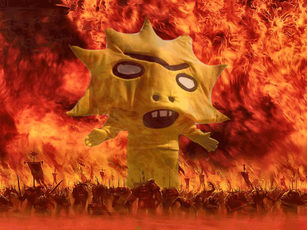
Why it’s great: Oh, my goodness, where do I even start? First, just standing this thing three feet wide of the post on an opposing penalty is sure to draw the kicker’s aim. Second, it aggravated these dimwits who advocate for the elimination of nuclear energy, because it looks kind of like their logo. Third, I don’t like children either. And finally, it’s inspiring some truly excellent Photoshop work, like the one below by Twitter user @MLSist.
 Why it’s garbage: Mascots exist to entertain children. That’s it. This thing is not going to entertain children, it’s going to make them soil themselves. Its creator, Shrigley, said that it’s supposed to represent “the angst of being a football fan.” The only angst I can imagine someone over the age of 10 experiencing with this creature present would come from the odour that costumes of this type inevitably begin to emit.
Haiku to describe Chris’ feelings when he saw this jersey:
Corporate branding
Meets bleak and dreary artist.
A yellow demon.
Other things we can’t believe somebody approved:
Somebody Approved This: 2015 NHL All-Star Jersey
Somebody Approved This: Mighty Ducks of Anaheim Retro Jersey
Somebody Approved This: Seattle Sounders 2012 Edition
Somebody Approved This: Canucks Mid-90s Third Jersey
Somebody Approved This: Adirondack Flyers New Years Eve Jersey


